Chart Tracker:
This was my second serious idea for the title of my magazine. I thought this title sounded really good and catchy. It also sums up what the magazine is centred around. I chose to have my title in a urban font for this one as
Tunes:
This was the first idea which i had, i also had a strong idea of how i wanted it to look but i wasnt able to do this on the computer and so i had to change my idea. My original idea was to have the word tune in blue swirls like 3 words saying tune over lapping each other, however i couldn't get the look of it how i wanted and so i changed the idea. I first had the idea for tune because of itunes. Million of people across the world have itunes and know what they are, i thought the title would be catchy and easily recognisable. I also thought that it had the effect of being short and snappy and this would make it a lot easier to remember.
Friday, 13 February 2009
Contents Page (Unfinished)

This is one of my contents page drafts. I really liked the look of this contents page as everything was set out and it was easy to read and follow. After researching some contents pages of music magazines i discovered they had been crammed full of text, pictures and advertisements and it was sometimes confusing to find what you where looking for. This can sometimes put people off from even looking at this page. Therefore i designed mine around the basis of making it clear and easy to follow. Most of this i have placed in my final design.
Front page of my music magazine
This is the same first draft of my music magazine, however this one has a different title font and it is in a different colour. This is because i wanted to get a feel of how the music magazine would look with different font styles and colours. I rejected this idea because i thought the dont took up too much room and was looking out of place and messy. I also thought that the colour of the font was to dark and didn't stand out as much as i wanted it to against the already dark background.

Monday, 9 February 2009
Photographs I have taken

This first photograph which i have taken i chose to use for my front cover of my music magazine. I thought the wall around them which disappears then, into the blackness behind them, helps to give the impression that they are only normal people who live in rough areas. This highlights the fact that they are ordinary, everday people and this could help to encourage people to like them. I also think it gives the impression that they where brough up living on the streets. I think the close space between them helps to show the intimacy between the two artists.

I liked this photograph, however when i was producing my magazine i discovered that it didn't really fit in on any pages.

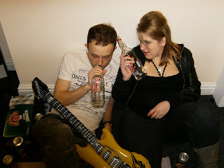
This is the photograph which i used for the double page spread. I liked this photograph. After researching many different music magazines i discovered that their pictures didnt tend to be artists in studios etc, most of their pictures had their artists in certain environments, such as a bus stop or in a bedroom. However the artists still had microphones and proper instruments.
I thought it would add to the joke if the guitar where to be a blown up one and have a plastic microphone with a really shiny top. I believe this had a comic edge to it and made the photograph more interesting. I also surrounded them with empty beer cans and bottles as props made the picture more interesting and added believability.

I really liked this photograph. I thought the joke microphone and blown up guitar work well and really make it look like a band messing around and having fun. However i believe that this photograph would probably have looked better if the two artists where standing closer together.
Subscribe to:
Comments (Atom)